Contrast between top and bottom
Sep 20, 2026
Short answer: Contrast between top and bottoms visibly splits the body in two. It works well when you want to highlight a line or create movement, and less well when you want to look tall and unified.
What contrast does to the silhouette
When your top and bottoms have clearly different colours, the eye sees two areas instead of one. The change between them becomes a horizontal line that divides the body. That can help, because it gives the outfit movement and marks a certain height. But it can also make you look shorter if that is not what you want.
Contrast divides, tone on tone unites
A light top with dark bottoms clearly marks the waist. If you want the opposite, keep one tone from top to bottom. The horizontal line disappears and the silhouette looks longer and more unified. See the men's bamboo sweatshirt, where top and trousers in the same colour give exactly that unbroken line.
Where the change sits matters
The change between colours reads as the middle of the body, wherever it actually sits. A long top that covers the hips moves the middle down and makes the legs look shorter. A shorter top ending at the waist moves it up. That changes your proportions, also when you choose pieces from all men's clothing.
A third colour links downward
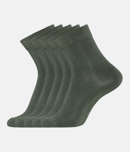
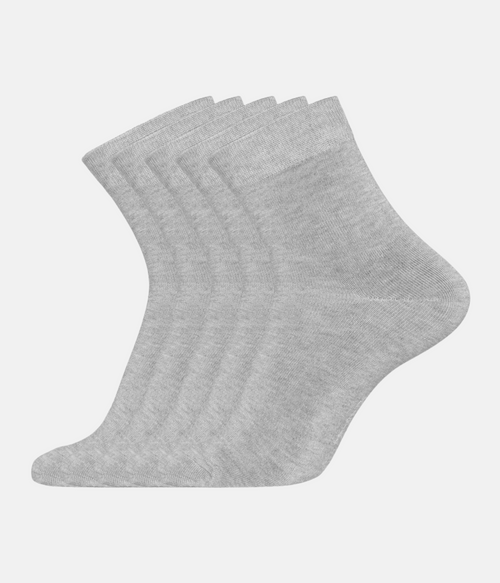
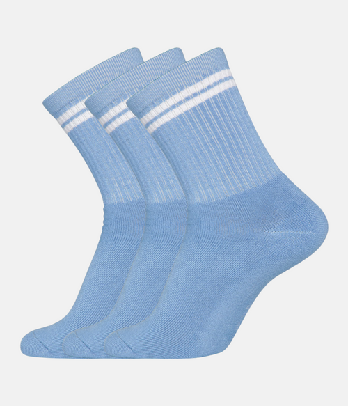
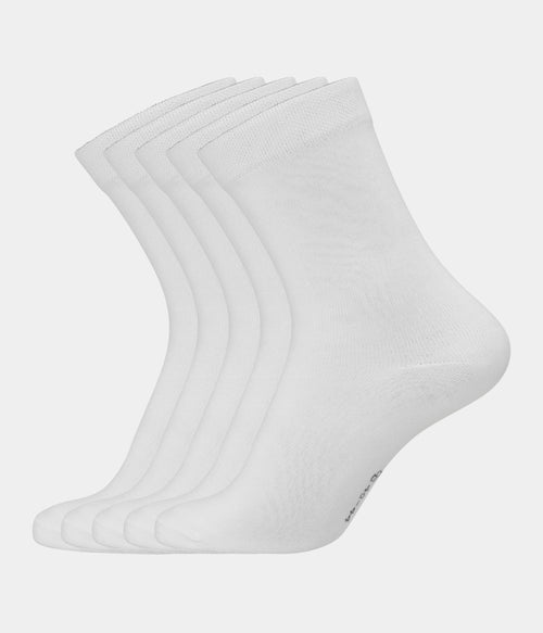
Socks in the colour of your trousers lengthen the leg, because the line continues into the shoes. Socks in the colour of your top break it again and add another change. Both can work, but it is worth choosing on purpose. See bamboo socks for men in colours that suit both your trousers and your tops.
When contrast is a good choice
Contrast is useful when you want to mark the waist or bring life to an otherwise simple outfit. It suits relaxed days when you want a bit more expression. A clear difference between top and bottoms can also help if you have long legs and want to balance proportions. Choose colours that sit well together, so it does not look harsh.
When to avoid it
If you want to look tall and unified, tone on tone or two shades of one colour is the better choice. This applies especially if you are not very tall, or want a calm look for a particular occasion. Here, strong contrast between top and bottoms is what divides the silhouette most clearly.
Soft contrast is a middle ground
You do not have to choose between strong contrast and none at all. A mid grey top with charcoal trousers gives a visible change that does not split the body as sharply. It is a good middle ground if you want some movement without losing the unified line. Check the difference in daylight before you decide.
Layers can move the line
An open sweatshirt or cardigan over a top creates vertical lines that work against the horizontal one. Wear a dark open layer over a light top with dark trousers, and the light part becomes a narrow strip that makes the silhouette look longer. It is a simple way to use contrast without splitting the body in two.
Frequently asked questions
When should you use contrast
When you want to mark the waist or bring movement into an outfit. It suits relaxed days when you want a little more expression.
When should you avoid it
When you want to look tall and unified. Tone on tone or two shades of one colour is the calmer choice that keeps the line intact.
Is contrast harder to get right
A little, because the two colours need to sit well together. Choose colours with a clear difference that still belong in one outfit.